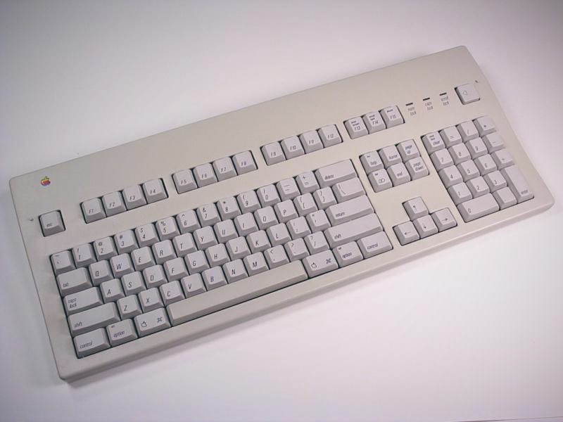
Function keys on the Mac has been around since 1987. But not many applications took advantage of them. Indeed, the Mac human interface guidelines says that the function of these keys are to be defined by the user. Hence applications that uses these keys are primarily cross-platform applications that haven’t been customized to fit the Mac’s guidelines.

Since their introduction on the Mac, function keys mostly double as hardware controls. Screen brightness, volume controls, and even media playback overloads these keys’ functions and accessible through pressing Fn (the other alternate key) combined with one of these keys. The F1..F10 functions themselves are so rarely used such that Apple made the hardware controls as the default functions and relegate the original F-keys functionality behind the Fn key (although users can still change it back should they need to).
Looking at this history, you should be able to see how the Touch Bar gained its form and function. It’s a combination of global controls (e.g. screen brightness, volume, or even Siri) with application-defined and user-customizable function keys.
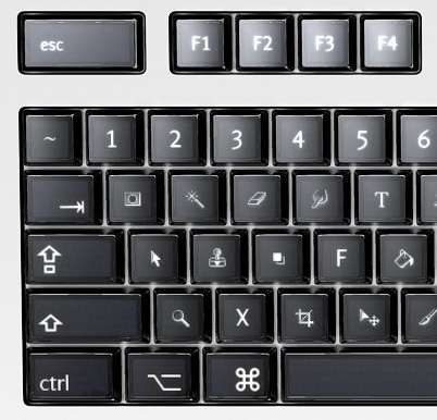
In a way the Touch Bar is a compromise of Art Lebedev’s Optimus Maximus keyboard. The latter was a full-sized keyboard in which every key is a mini-display of its own, capable of transforming every button to just about any function. However the electronics required to support such a feat made the keyboard both heavy to carry and heavy to type on. The keys had such a high resistance that it would quickly exhaust the user typing on it. In any case it was an impressive engineering feat at the time (circa 2006).

The size and bulk of display-keyboards makes it impractical for use in laptops. Cast aside Apple’s engineering craze for thinness, there are legal requirements on how big laptop batteries can be (mostly due to airline safety regulations). That said, Apple’s acquisition of Sonder may indicate that they are working – or at least thinking – about fully changeable keyboards.
On the other hand, full touch-screen capacitive keyboards does not work well for typing long proses. As there is no tactile feedback, users would often need to look down on the keys to find them. In contrast, physical keys can easily be found by location and feel. The existence of a market for iPad keyboards (or even Microsoft Surface keyboard) shows that there is a need for physical keyboards.
Due to those considerations, it makes sense to focus touch-screen keys to those that are generally application-defined. It provides quick access at the keyboard without the user needing to remember yet more shortcut key combinations. In contrast having the alphabetic keys customizable would be useful mostly to those who need alternative keyboard layouts (such as Dvorak) or need to type non-ASCII languages – in the cost of heavier electronics or elimination of tactile keys.
Technically the touch bar is a sliver of capacitive touch screen. But really interaction-wise it’s a keyboard first and screen second. Even Apple warns not to use it as a display in the human interface guidelines. For example, running Doom on it probably isn’t something that they want. Nevertheless, if Doom would have the status bar on the touch bar, it would probably make sense.
When designing Touch Bar layouts for your application, be sure to cater for muscle memory. That is, try to keep buttons at the same locations throughout your app. This will reduce the need for the user to look at the keys before pressing the touch bar. Remember the user can’t really feel (yet) the virtual buttons on the touch bar.
One way to facilitate muscle memory is by having a grid system on the Touch Bar. Group buttons into zones from the most general to the more specific from left to right. Have the always-present (or almost-always present) buttons on the left zone. The middle zone should cater for the currently focused element in the screen. Whereas the right zone should be reserved for special editing or input functions (such as entering emojis).
However for modal dialogs or transient user interface elements (such as popovers), you might want to override the standard grid because most of the global buttons won’t be applicable for the context (or may even be disabled). In these cases, having a principal item that dismisses the modal dialogs would make sense. Since the principal item is placed in the center of the Touch Bar, likely they’ll push out other lower-priority items. The Touch Bar API states there’s only one principal item that can be visible at one time – but that item can be a group item and contains many more sub-items. Indeed this is the approach taken by NSAlert when it is displaying a modal dialog.
You can use the touch bar item’s visibility priority to determine which items that would get pushed out by the principal item. Similarly you can also use this to keep the Touch Bar populated, and still would make room for higher-priority items. Just remember the grid system that you’ve set for the entire application – items that are meant to occupy the same space in the grid should have the same priority hence would be pushed out or pushed in as a cohesive unit.
Furthermore, don’t hesitate to have some secondary output in your Touch Bar display. Yes, Apple say not to use it as a screen – however it’s merely a guideline and not hard rules. If it makes sense and your users like it, then don’t hesitate. One of my apps uses the Touch Bar as both extended toolbar and mirrors some of the information on the screen and it was approved to the Mac App Store.
Scuttlebutt Example
Scuttlebutt is one of my apps that recently received touch bar support. It is a native client for Yammer – a social media and collaboration web application meant for use by corporations. With Scuttlebutt, you can browse updates in Yammer, post updates, browse users, and other community-communication function.
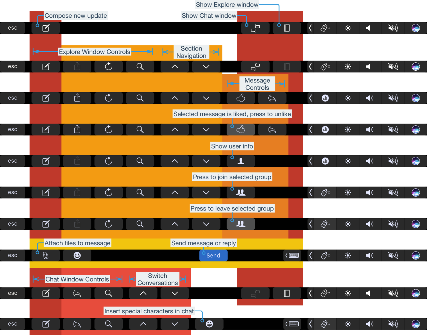
The picture below shows an overview of all touch bar buttons available in Scuttlebutt as of this writing. In this picture, the “grid” is shown as color-coded backgrounds.

Notice that the compose button is always present and overridden only when the user is currently composing something. The next group of buttons would be pertaining to the active window. Tn this case there are two primary window types in the application: the Explore window and the Chat window. Each window types has its own respective global buttons in the touch bar. On the far right (near the hardware controls strip) there are two low-priority buttons for toggling between the two primary window types. Because they are low-priority, these buttons becomes prominent when there are no windows visible (as depicted in the touch bar configuration at the top).
Somewhere at the center there are buttons provided by the currently focused item. When the user is focusing on a message cell, this area shows a like and a reply buttons – which are directly actionable actions on the message. Other items provides other context-sensitive actions in this area of the touch bar.
However when the user is composing an update or posting a reply, the entire Touch Bar becomes dominated by this action. The principal button Send gets placed right in the middle and the only remaining buttons in the Touch Bar are those that helps writing the message in the first place (that is, the attachment button to attach files and the built-in emoji button). Since messages are typically short (remember that this is a social media application), those are composed via popovers that are inherently transient. Thus it’s a good idea to let the user focus on the composition before moving on.
Speech Timer example
Another of my recent Touch Bar implementation is Speech Timer – this is a small utility application for use in Toastmasters gathering. It measures the time of speeches, signaling to ensure the speakers doesn’t go over-time or under-time, and tracking who did what type of speech.
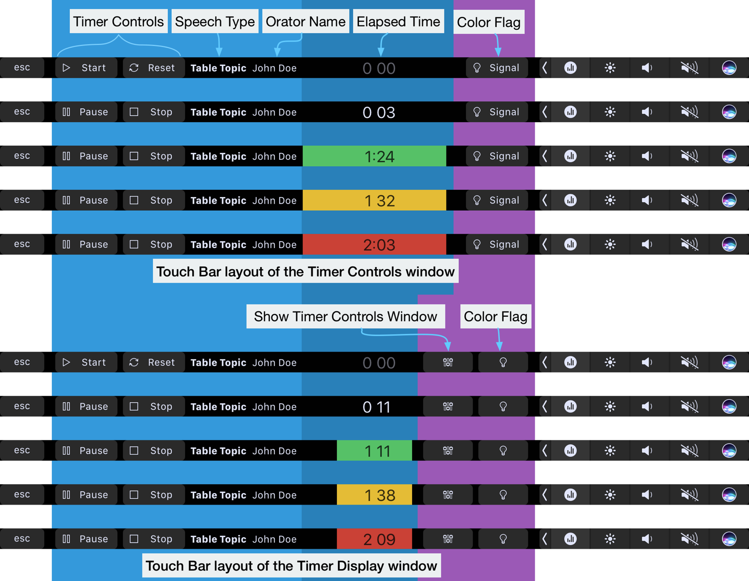
Shown below are some examples how the touch bar looks in Speech Timer. There are two primary window – a Timer Controls window that the operator uses to control the timer and an optional Timer Display window for placement in a projector or TV screen that the speaker can see while he is speaking.

One major difference is that there is a display in the Touch Bar. It makes sense to mirror the timer display and color indicator flags on the Touch Bar. When the operator presses the Start button on the Touch Bar, he gets instant feedback and can see that the timer is running from the Touch Bar itself. Similarly pressing Pause or Stop buttons would reflect both on the screen and the Touch Bar itself.
This is one example that Apple allows the Touch Bar to become a secondary display. The Touch Bar update was submitted to the Mac App Store and was approved. So you could use the touch bar as an auxiliary display – if it makes sense to do so.
Closing Remarks
What if you don’t have a MacBook Pro with a Touch Bar? Apple recommends the Touch Bar Simulator that comes with Xcode. Note that the Simulator would show the touch bar for all applications and not just your own app. This is a pretty good way to see how others implement their Touch Bar support. Another way is to use Red Sweater’s Touché app. The latter would be a lightweight option to see other applications’ Touch Bar configuration without needing needing to keep Xcode running and save some RAM in the mean time.
Lastly, remember not to go Touch Bar crazy. The Touch Bar is an alternative way to reach your app’s functions – not the primary method. Even some people who has a Touch Bar may not use it all the time. They may use an external keyboard and monitor with their MacBook Pro while on their desks, hence doesn’t normally look at the Touch Bar. A big negative example is showing an alert only on the Touch Bar when it is present. When the laptop is docked, the user may not even be looking at the built-in keyboard and monitor, hence can’t see the alert on the Touch Bar.
That’s all for now folks. Until next time.
0 thoughts on “Touch Bar Design Tips”